Can a protein drink inspire a generation to rediscover their best selves?
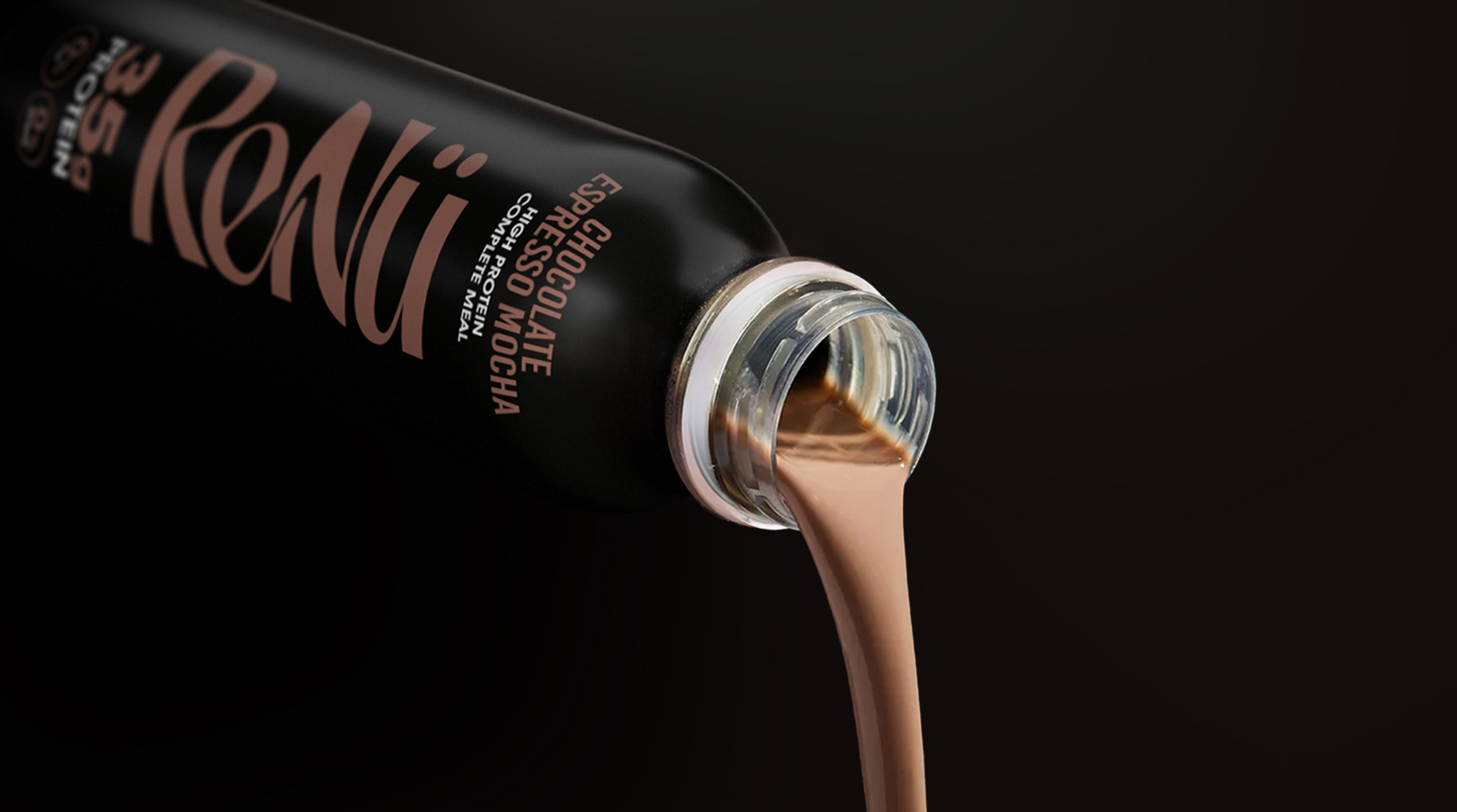
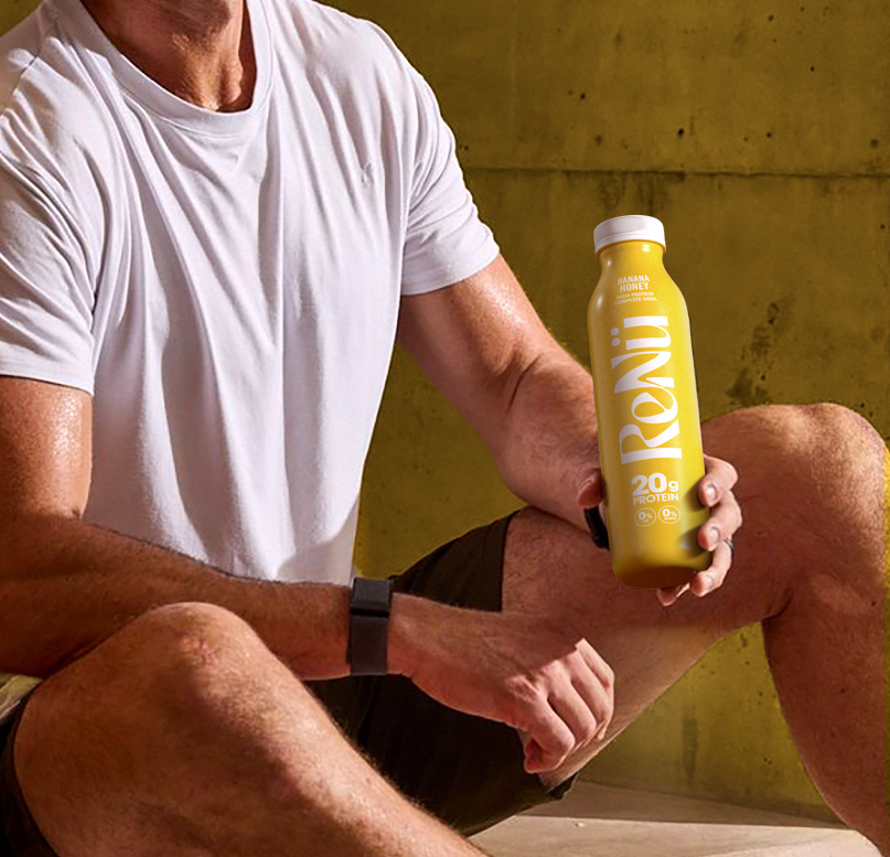
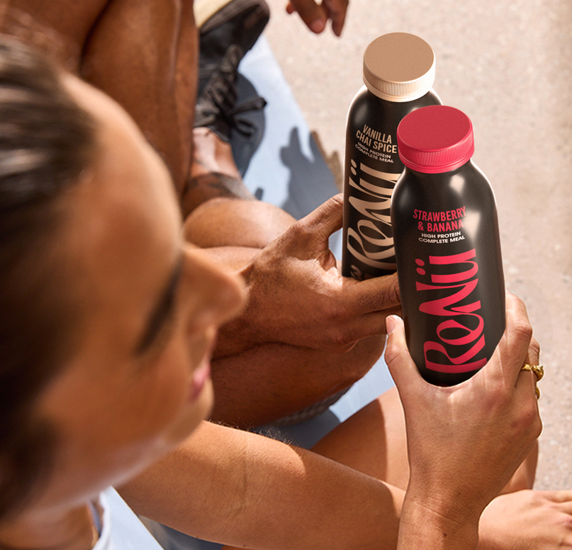
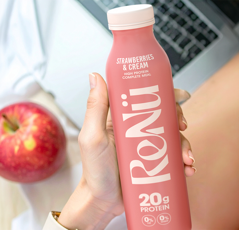
ReNü is a premium protein drink created for people entering the next stage of their lives with energy and purpose. It supports those returning to fitness or maintaining strength with a renewed sense of confidence and vitality. Six colourful bottles offer 20 grams of protein in refreshing flavours, while the sleek black range delivers 35 grams for deeper recovery. The brand positions strength, wellness and renewal as timeless qualities rather than fleeting trends.


Most protein drinks focus on performance and youth, leaving a gap for mature consumers seeking quality, taste and design. This audience values health but rejects the aggressive imagery of sports nutrition. The challenge was to create a product that reflected their lifestyle – sophisticated, balanced and aspirational. ReNü needed to represent confidence, not competition, and celebrate renewal instead of resistance to age.
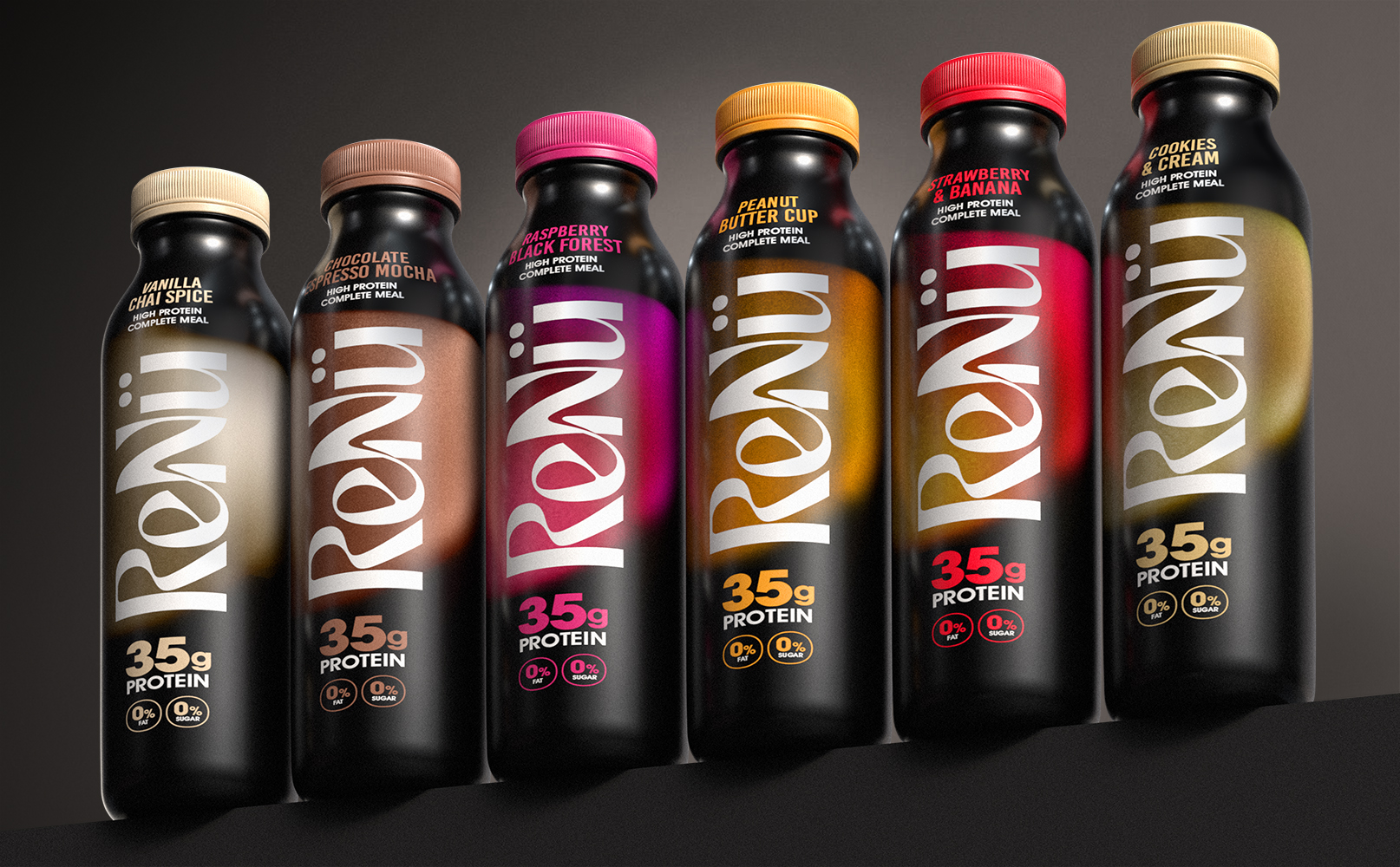
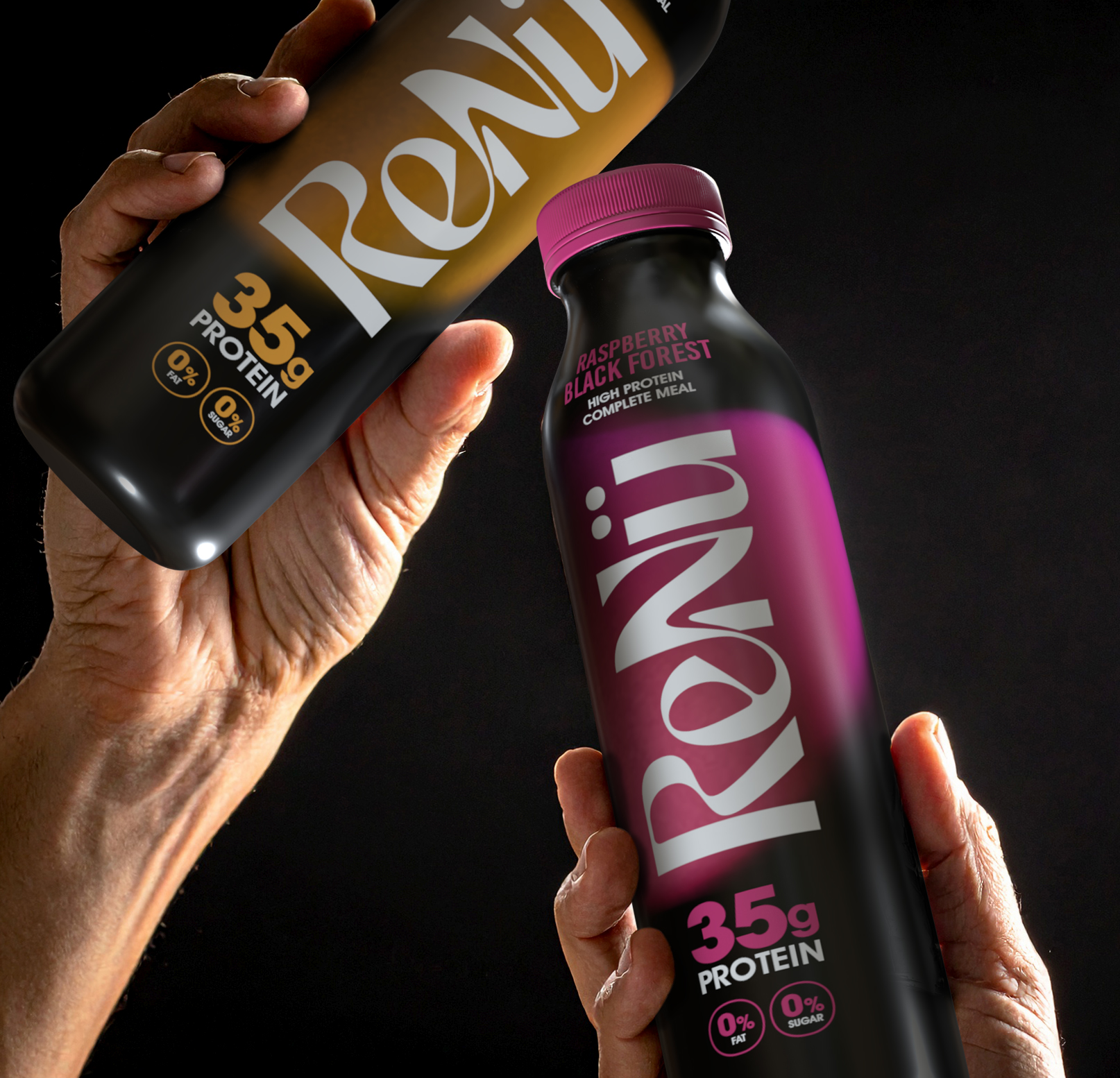
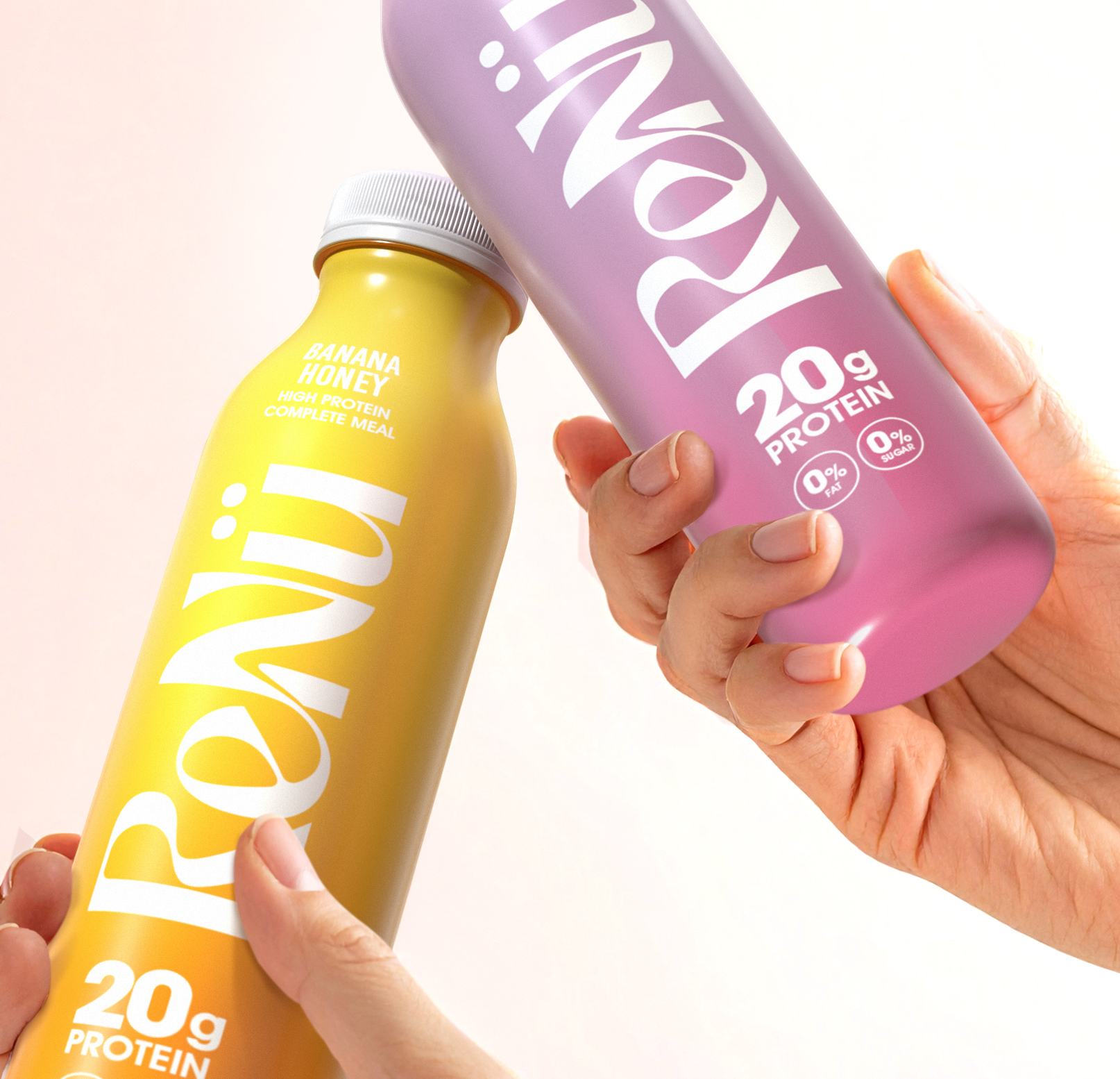
The creative solution centred on elegance, flow and modern simplicity. The ReNü logo connects the e and N through a subtle graphic transition symbolising rebirth, progress and the journey from the old self to the new. The 20-gram colourful range represents daily vitality, while the 35-gram black range conveys indulgent strength and recovery. Every design element — from colour and typography to tone — communicates movement, energy and quiet sophistication.
ReNü redefines what strength looks like beyond 50, turning protein into a lifestyle statement. It empowers people to rediscover their confidence and see ageing as evolution, not decline. The brand bridges wellness and style, appealing to a demographic often overlooked in the fitness world. Through refined design and purpose, ReNü becomes more than a drink – it becomes a symbol of renewal.
Show more work
