Can a brand identity truly capture the movement of energy within us?
M:REIKI is a contemporary Reiki studio founded by Michelle, centred on the belief that energy is the foundation of holistic healing. Rooted in ancient practice yet expressed through modern design, M:REIKI exists to realign the flow of life force within the body, dissolve blockages, and restore balance to mind, body and spirit. The brand identity reflects this philosophy by transforming abstract concepts, flow, movement, energy, and light, into a tangible, immersive visual experience. Every element, from colour to motion, works together to capture the essence of Reiki’s transformative power.
Get in touch


The challenge lay in expressing something inherently invisible, the subtle movement of energy, in a way that feels authentic, modern, and deeply resonants. Reiki is not about spectacle or surface-level wellness trends; it is about internal transformation. The brand needed to communicate this depth and spirituality while remaining accessible and inviting to a contemporary audience.
The visual identity had to reflect not only the philosophy of Reiki but also the specific, layered nature of the practice, from grounding the root chakra to awakening the crown. It was essential to embody the transition from stagnation to flow, from blockage to release, and from rigidity to harmony.


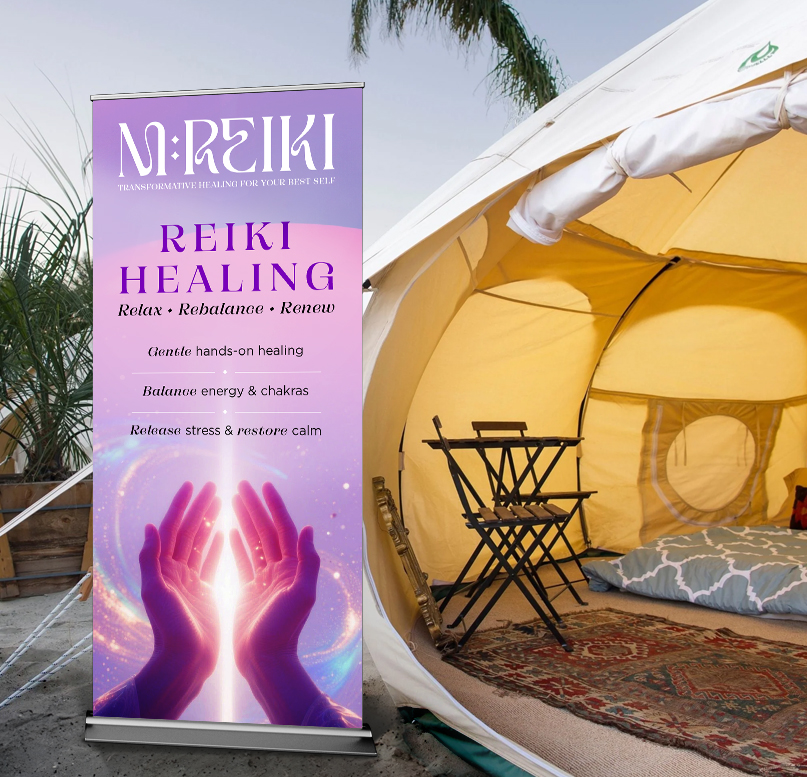
The flow of colour is integrated directly into the typography, weaving through letterforms to suggest energy being channelled and transferred from one part of the body to another. The M:REIKI logo itself transitions from a structured, rigid form into a fluid, organic shape, reflecting the Reiki process: what begins as blocked or stagnant gradually softens, releases, and flows freely.
Imagery completes the experience, bathed in radiant light and gentle heat, evoking the sensation of energy being released and renewed during a session. The result is a brand identity that is not just seen but felt, a living, breathing expression of healing energy made visible.