How can a yoga studio embody light, balance, and authentic spiritual depth?
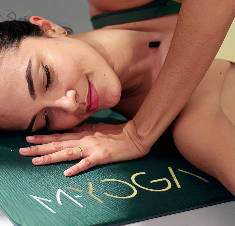
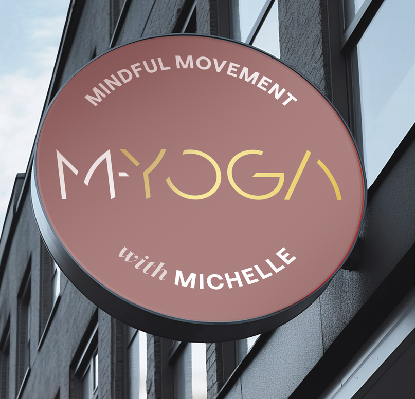
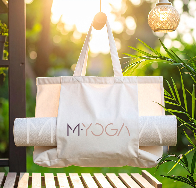
M-YOGA is an independent yoga studio devoted to mindful movement, inner balance and spiritual illumination. The identity captures a tranquil, transcendent atmosphere through the gentle use of rose gold, which conveys warmth, complemented by subtle gold detailing in the wordmark to represent glistening light and enlightenment. Celestial motifs, including stars and the moon, symbolise universal cycles, balance, guidance and transformation. These elements reflect yoga philosophy and cultivate a profound sense of harmony and connection.


The studio required a cohesive brand identity that could convey authenticity, spiritual depth, and a calming, restorative energy, while distinguishing itself in a market saturated with generic wellness brands. It needed to genuinely reflect the values of its founder, a true yogi, and create an inviting yet elevated aesthetic that would resonate with both seasoned practitioners and those completely new to yoga.
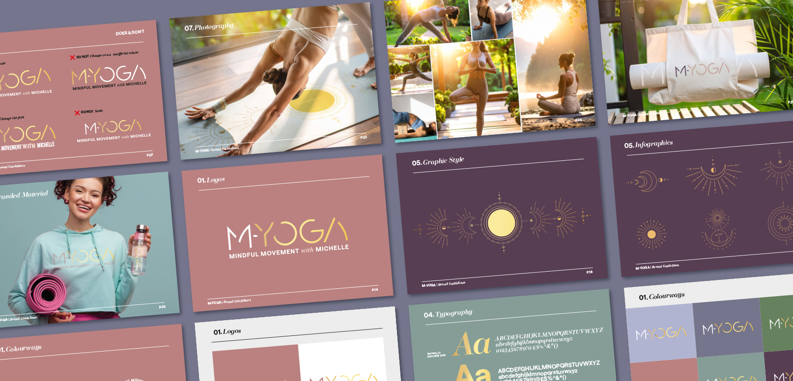

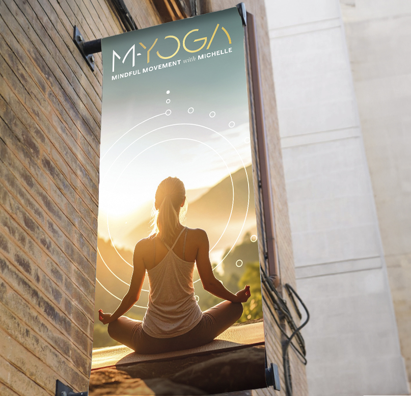


Through the use of refined colour palettes, thoughtful symbolism and elegant typography, the brand design communicates both serenity and illumination. Rose gold tones bring warmth and openness, while gold highlights embody light, wisdom and transformation. Celestial symbols connect the brand to universal rhythms and cycles, offering a sense of guidance and spiritual resonance. The result is an identity that feels both grounded and transcendent, aligning seamlessly with the studio’s ethos.

Show more work
